Team:Groningen/Model

Modeling
Introduction
The Design-Build-Test-Learn (DBTL) cycle is an integral part of the process of engineering and optimizing a genetically engineered microorganism. However, going through a single DBTL cycle often requires both a lot of time and resources. Therefore, it would be beneficial to keep the number of DBTL cycles needed for a project as low as possible. This can be done by making well informed inferences about the parts of a microorganism one tries to optimize. Various types of modeling can be used to gain the information needed for making those inferences.
Our project revolves around optimizing the production and activity of alpha-amylase in Saccharomyces spp. There is however a plethora of different parts within the Saccharomyces spp. and growth conditions that can be optimized. Several of these parts and growth conditions do not need actual experiments, but can be optimized based on models of the various parts and microorganisms. Other parts can be optimized using a combination of experiments and modeling. In our project, we tried answering the following questions with help of modeling:
- Which combination of Saccharomyces spp. strain, secretion peptide, promoter and alpha-amylase encoding gene results in good alpha-amylase activity?
- Could the activity of the most recommended alpha-amylase gene be further increased by optimizing the binding site?
- The aim is to grow our Saccharomyces spp. on the ammonia captured using the MOF (see out Project description page). What ammonia concentration of the growth medium would yield the best growth conditions?
Different models and modeling techniques were used to (partially) answer these questions.
While writing about the different models we used, we wanted to make the content understandable and accessible for as many individuals as possible. Therefore, we did not only explain the results of our models, but also went into more detail about the theory behind the models and how to interpret the results. We also attached tooltipsThis is a tooltip! to terminology often used when using these models. Hover over the word in order to see the definition of the word in case you are not familiar with the used terminology.
The Automated Recommendation Tool
If one wants to know which combination of Saccharomyces spp. strain, promoter, secretion signal and alpha-amylase encoding gene yields the best result, a naive approach would be to test every possible combination. In our project, we included:
- 4 different Saccharomyces spp. strains
- 10 different promoters
- 4 different secretion signals
- 4 different alpha-amylase encoding genes
Testing every single possible combination would mean that $4*10*4*4=640$ combinations need to be tested. As our summer was already pretty swamped with other iGEM related activities and our budget was not particularly big, we decided that this would not be a very feasible option. Therefore, we decided to use Machine Learning (ML) to guide our search for a good combination of part-variants. By only testing a relatively small subset of all possible combinations, it is possible to make inferences about the non-tested combinations using ML.
Have a look at our Engineering page to see which combinations were eventually selected for further testing.
The ML tool we decided to use is called the Automated Recommendation Tool (ART). It is developed to guide synthetic biology in a systematic fashion, without the need for a full mechanistic understanding of the biological system. ART can be used for the following typical metabolic engineering objectives:
- The maximization of the production of a target molecule (e.g., to increase Titer, Rate, and yield, TRY)
- Its minimization (e.g., to decrease the toxicity)
- To reach a specific objective (e.g., to reach a specific level of a target molecule for a desired beer taste profile).
Under these circumstances, proteomic and transcriptomic data is generally used as the input data[1]. In our case, the main interest lies in optimizing the activity of a single enzyme. As our focus is on the activity and not the abundance of the enzyme, proteomic data on the absolute protein content of the microorganism is not a representative performance measure. Furthermore, transcriptomic data of the gene which encodes for alpha-amylase is not the only variable which can influence the activity of alpha-amylase. The strain in which the enzyme is produced, the secretion peptide of the protein and the variant of alpha-amylase also influence activity of the resulting enzyme. Therefore, a different measurement type is needed as input data.
Zhang, Petersen & Radivojević et al.[2] faced a similar problem. They varied the promoters of 5 different genes in order to optimize tryptophan biosynthesis in Saccharomyces cerevisiae. However, transcriptomic data of each gene was not available. What they did instead, was looking at which promoter combination yielded the best tryptophan biosynthesis. From a Machine Learning perspective, finding the right promoter for each gene is analogous to finding the right strain, promoter, secretion peptide and alpha-amylase encoding gene combination. In both cases, the model has to pick a subset of combinations which are expected to give good results out of a large combinatorial libraryA combinatorial library refers to the set of all possible combinations that can be made by combining the different part-variants..
Now that the reason for using the tool has been explained, we will go into more detail about the theory behind the ART and ML in general. We will follow the general scheme of the pipeline we designed. This pipeline is shown in Figure 1. A separate Jupyter Notebook has been uploaded to our github page for each step of the pipeline. The requirements for running the code can be found there as well. Note that a licence is needed in order to run the ART. Information on how to apply for an academic licence can be found here.
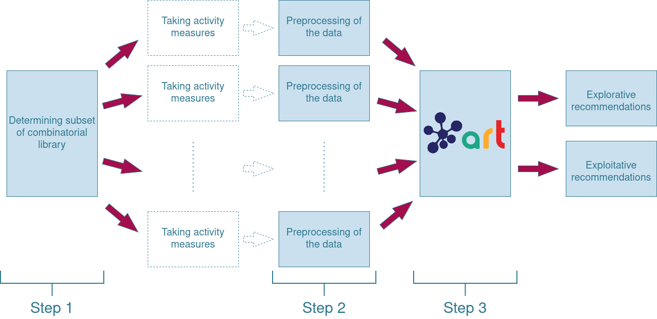

Step 1: Creating a well-balanced subset of the combinatorial library
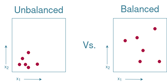
In order to be able to make predictions, training data is needed. This training data however needs to be representative of the complete set of possible combinations. This set of possible combinations is often referred to as the search spaceIn Machine Learning, the search space refers to the set of al possible input values. In the current setting, this would be all the entries in the combinatorial library. . There are multiple ways of sampling from this search space. The key is to create a balanced subset where every area of the search space is represented. Take for instance a simplified example with only 2 variables, $x_1$ and $x_2$. In Figure 2 there is an example of an unbalanced subset where all elements come from only a very small region on the search space. There is no information available on what would happen if we were to take a sample from the upper right corner of the search space, while the lower left corner is overrepresented. Compare this to the balanced subset, and you see that it is possible to sample a greater area of the search space using the same amount of measurements.
Note that it is not always necessary to spread out the elements from the subset as evenly as possible throughout the search space. If there is prior knowledge available on which regions of the search space are likely to yield good results, it might be wise to take more samples from that region in order to improve predictions regarding that region. If you know that other regions of the search space are likely to yield bad results, it suffices to only take a few measurements from those regions. For our project, we are assuming that no prior knowledge is available. Therefore, the aim is to sample from the subset as evenly as possible.
One could try to manually select the elements from the subset. A problem is that this becomes increasingly more difficult as more dimensions are added to the search space. In the previous example, only two dimensions were used. For our project however, there are already $4+10+4+4=22$ dimensions. While it is already close to impossible to image such a large number of dimensions, it is only a fraction compared to the input dimensions of the current state of the art ML applications. The current biggest ML application has an input of $50257*2048\approx1.0*10^{8}$ dimensions[3]. One can imagine that it is infeasible to craft the input set by hand for data with such a high degree of dimensionality.
Thus, some automated way of picking the training set is advisable. In our approach we decided to randomly generate a subset and verify whether that picked subset is balanced. Directly looking at where the samples are located within the search space is impossible since, as just discussed, it is incredibly difficult to visualise the search space. Therefore the distribution of the subset within the entire search space has to be visualized in a different manner. An easy way of doing so, is looking at the occurrence of each value in the subset. If these values are somewhat uniformly distributed, that would be a great first indication of having a varied subset.
In order to visualize what to look for, the example given in Figure 2 is extended in Figure 3. Note that the example given is not directly applicable to our project as the $x_1$ and $x_2$ variables are continuous, while our project uses categorical variables. The continuity of the $x_1$ and $x_2$ variables can be “removed” by placing each value in a separate “bin”. These bins are indicated by the grid pattern drawn in Figure 3. By counting how often a variable occurs in a bin, it is possible to see whether one value of a variable occurs more often than other values. Figure 3 shows that the values of the balanced subset are evenly distributed across all bins. The distribution of the values in the unbalanced subset shows that the lower values are overrepresented, while the upper values do not occur at all. Therefore, the plotting of the distribution of the values can give the first insights on whether the subset is balanced.
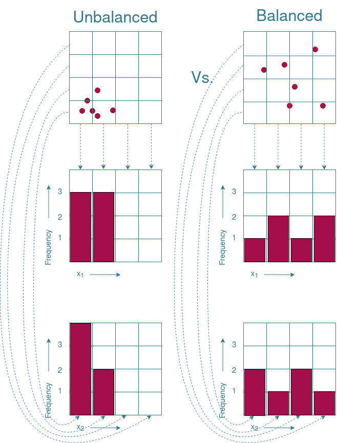
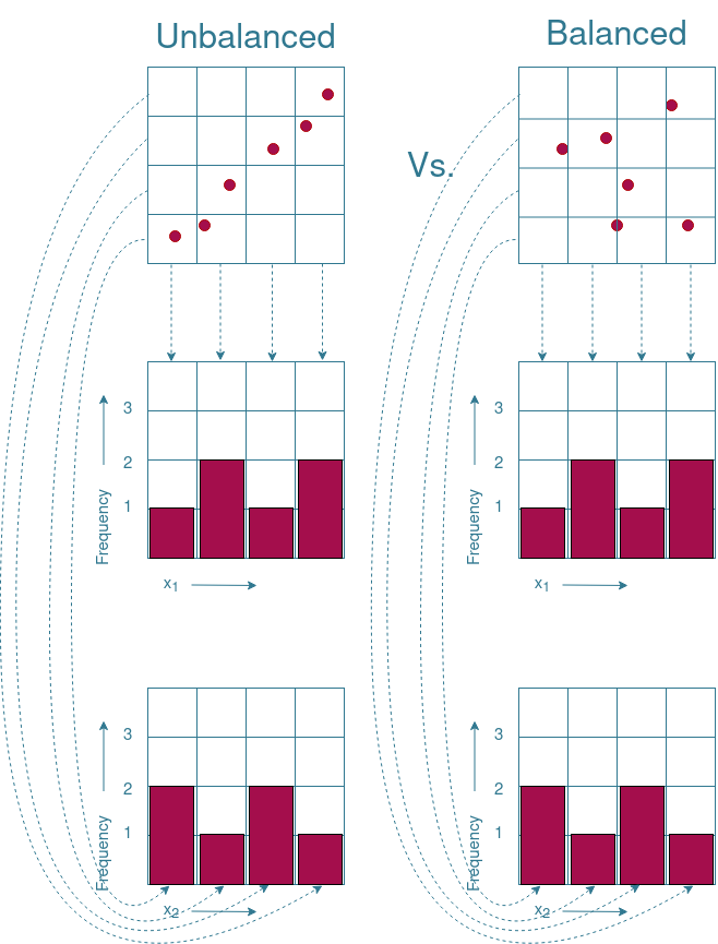
There are however boundary cases where an even distribution of values does not necessarily mean that the subset is evenly distributed across the search space. An example of such a boundary case is given in Figure 4. As you can see, the frequency distributions of both subsets are identical to each other, while one of the subsets is balanced and the other is not. Therefore, additional visualization techniques are needed to ensure a properly distributed subset.
Measuring variance using Principal Component Analysis
Principal component analysis (PCA) can be used to capture the variance within a dataset. The mathematics behind PCA are rather complicated and fully understanding might take some effort. Therefore, this page will stick to the general use of PCA and the ideas behind it. If interested in a more in depth explanation, there are plenty of educational materials available online. For instance, a comprehensive but still relatively complicated explanation was written by Jonathon Shlens. For a more intuitive explanation, Markus Ringnér wrote a short read on how PCA can be used to explore high-dimensional data[4]. The same subject is covered in this video for those that prefer watching a video instead of reading about it. Whatever you prefer, please make yourself familiar with the concept of PCA before reading this section. Otherwise it might be difficult to follow.
PCA is often used to reduce the dimension of the data while retaining most of the variation in the data set[4]. By identifying directions within the dataset in which variation is maximal, Principal Components (PCs) are used to project the data points onto those directions. This way, a PC $j$ captures a portion of the variance within the dataset ($v_j$). However, some dimensions of the original dataset have a greater influence on the direction of $j$ than other dimensions. How much each dimension $i$ contributes to a PC $j$ is expressed by the load ($l_{j,i}$) of the dimension on the PC. Placing the load of each dimension into a single vector creates an eigenarray ($\vec{l_j}$) of PC $j$. If we were to take the absolute value of the load of a dimension and divide it by the sum of all absolute loads in the eigenarray, you get the a weight vector $\vec{w_j}$ which expresses how much each dimension contributes to PC $j$:
$$ \vec{w_j}=\frac{abs(\vec{l_j})}{\sum(abs(\vec{l_j}))}$$
All $\vec{w}$ can be combined into a single weight matrix $\mathbf{W}$. In order to get the total variance that can be attributed to a dimension $\vec{var}$, simply take the dot-product between $\mathbf{W}$ and $\vec{v}$:
$$ \vec{var}=\mathbf{W}\cdot\vec{v}$$
Therefore, PCA can be used to determine how much each dimension of the input data contributes to the overall variance within the subset. It must be noted that this does not provide a guarantee that the selected subset is well balanced, but it does provide additional insights on whether the selected subset is well balanced.
Applicability to our project
Now, how does this relate to our project? Well, we decided to try and test $10\%$ out of the 640 elements in the complete combinatorial library. Our hopes where that we would end up with at least half of them providing useable results, as $5%$ is more than the $\sim 3\%$ which has been shown to be enough for the ART to produce useable results[2]. The goal of what is explained above is to determine whether each part-variant is sufficiently represented in the subset we intended on testing. One way of doing this is to plot the frequency distributions of each part. The frequency distributions of the part-variants are shown in Figure 5. A quick glance at these distributions shows that for all parts, there are no variants that barely occur. While this is a good first sign, additional analysis is preferred to allow for a better judgement.
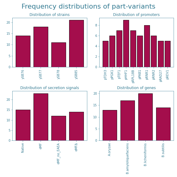
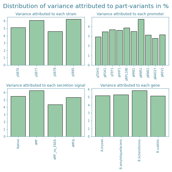
Therefore, we also looked at how much each part-variant contributed to the variance within the subset. Those results are shown in Figure 6. These results even out the differences between part variants even further and hence decided to stick to this subset. The exact part combinations of the 64 chosen samples can be found on our Engineering page.
Accounting for lost samples
Science wouldn’t be science if things didn’t go wrong from time to time. During various stages in the experimental process, we had to exclude the following samples:
- #07 since it did not assemble correctly.
- #17, #40, #43, #48 and #64 due to faulty vials breaking during the spinning down of the cell culture.
- #21 for not showing a linear absorbance measurement with respect to time during the alpha-amylase assay.
- #57 due to running out of reagents for the alpha-amylase assay kit
- #03, #04 and #36 and due to the prospect of running out of alpha-amylase assay kit reagents and them not showing promising results in earlier tests.
- #06, #11, #20, #21, #42 and #59 as the variance within the replicates deviated too much compared to the mean variance (more on this later on this at step 3 of the ART pipeline).
In total, $7.3\%$ ($\frac{(64-17)}{640}*100=7.3$) of the complete combinatorial library is tested as training data for the ART.
The exclusion of these samples could however cause some part-variants to become underrepresented. After removing afore mentioned samples from the subset, the frequency and variance distributions shown in Figures 7 and 8 were obtained.
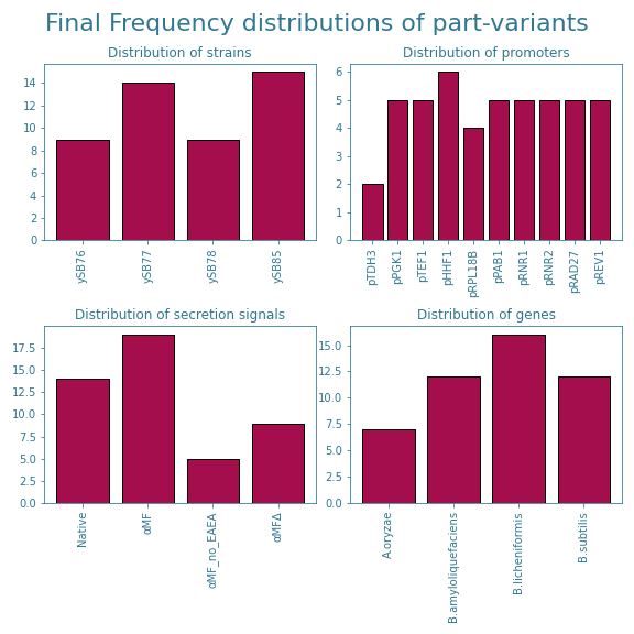
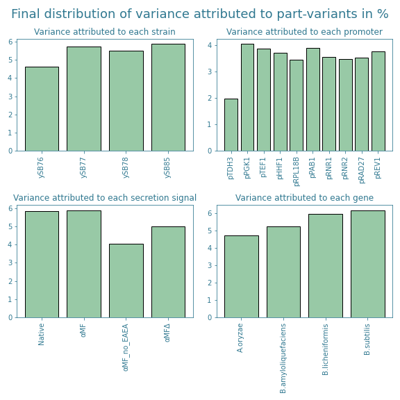
The new distributions show that the promoter pTOH3 and the secretion signal αMF_no_EAEA are now slightly underrepresented. Furthermore, looking at Figure 7, we see that there is a slight overrepresentation of the secretion signal αMF and the alpha-amylase gene originating from B. licheniformis. This trend is not shown in Figure 8, but it is good to take into account when analyzing the final results from the ART.
Step 2: Preprocessing of the data
After measuring the activity of the selected samples, it is time to process this data. In the notebook on our github, the steps required to go from raw measurements to activity values are also included. The protocol for this is given at the Experiments page. We deemed these steps to not be part of the actual model and thus we won’t go into more detail. The results can be found at the Results page. However, once the activity of the samples have been determined, the data is not yet ready to run through the ART.
We noticed that most of the samples showed activity values somewhere between $1*10^{-5}$ and $1*10^{-4}$, while there were a few samples that showed activity values as high as $6*10^{-3}$. This means that there are almost three orders of magnitude between the data points. As a result, most of the activity values between $1*10^{-5}$ and $1*10^{-4}$ will be interpreted as being 0 by the ART. In order to enhance the differences between those lower activity values and bring these values closer to the highest activity values, the natural logarithm of these values was taken. This transformed the data from the Results page into the data shown in Figure 9, 10 and 11. As you can see, all values are now between -5 and -12, effectively mapping the activity values to a scale of only a single order of magnitude.


Step 3: Running the ART
Once the data has been preprocessed, it is ready to be used by the ART as training data. However, to understand how the ART works and how to interpret the results, one needs to understand some basic principles on ML. Therefore, we first go through two well-known issues associated with ML. Please bear in mind that this is by no means an exhaustive list. These two issues are mainly chosen to give a better insight in what one tries to achieve when applying ML. Afterwards, we will discuss how these issues are often mitigated and which techniques ART utilizes to mitigate these issues even further. In the end we will show how the ART was eventually applied to our project and what can be concluded from the results.
Difficulties of Machine Learning
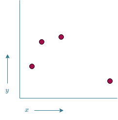
One of the applications of ML is function approximation. Suppose there is some vector of input variables $\vec{x}$ and that there is some unknown relation between these input variables and some target variable $y$. In other words, there is a function $f_{\theta}(\vec{x})=y$. The aim of ML is to find out what this $f_{\theta}$ looks like. It is often physically impossible to determine the exact function $f_{\theta}$, so instead we create a modelAnother way of thinking of a model, is seeing it as an approximation of the physical entity. As the true $f_{\theta}$ cannot be determined, we approximate it using $\overline{f}$ $\overline{f}$. There are however several ways of creating such a model. Consider the following example; There is only a single input variable $x$ that needs to be mapped to a single output variable $y$. All the data available are values for $x$ and the corresponding $y$ values. If we were to plot these values in a 2D plot, it would look something like what is shown in Figure 12. The goal is to find a $\overline{f}$ such that predictions can be made on values of $x$ for which no corresponding $y$ value is available.
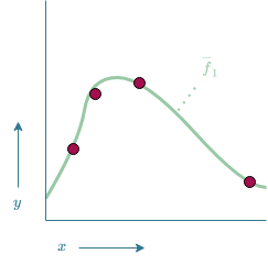
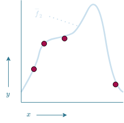
Now, a possible model $\overline{f}_1$ could be given by the function drawn in Figure 13. $\overline{f}_1$ manages to make accurate predictions on the known data as it passes through all data points. There is however some uncertainty involved in how accurate this model is. How can we for instance be certain that $\overline{f}_1$ is the correct model and not model $\overline{f}_2$ which is shown in Figure 14? Both models fit the training data equally well, thus in a logical sense, both models would be equally likely. Based on Ockham's RazorOckham's Razor states that "plurality should not be posited without necessity"[5]. This if often interpreted as "an explanation should not be overly complicated without necessity". (also referred to as the law of economy[5]), $\overline{f}_1$ would be preferred over $\overline{f}_2$ as it is the simpler solution. However, there is simply too much uncertainty involved in order to say for certain that one model is better than the other.
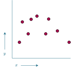
In the previous example, we also implicitly assumed that the data points did not contain any noise. What if the measured values do not originate from $f_{\theta}$, but instead originate from some noisy function $f_{\sigma}=f_\theta+\epsilon$, where $\epsilon$ is some random variation. The measurements now look something like the data points shown in Figure 15.
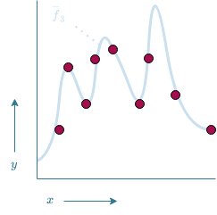
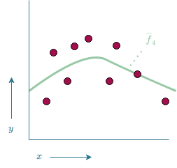
Simply fitting a model $\overline{f}_3$ to all data points would yield the model shown in Figure 16. While it would in theory be possible that $\overline{f}_3$ accurately models $f_{\theta}$, chances are high that the model is trying to fit itself to the noisy function $f_\sigma$ instead of the target function of $f_\theta$, often referred to as overfitting. Therefore a “smoother” (i.e. less complex) model $\overline{f}_4$ might be a more accurate representation of $f_\theta$, as shown in Figure 17. One could also argue the $\overline{f}_4$ has been “smoothed-out” too much and is no longer an accurate representation of $f_\theta$. If this is the case, we are dealing with an under fitted model. This raises the question on how to strike the balance between over- and underfitting.
“Overcoming” the difficulties of ML
One of the ways of dealing with uncertainty is to simply take more measurements at a wider range of possible input variables. For our project, this would mean to increase the subset of the combinatorial library that we would like to test and thus conduct more experiments. These additional experiments are however costly both in time and resources. Hence, we decided to try and spread out our measurements more evenly as possible across the search space as discussed in the previous section. By doing so, we gain as much information as possible about the hypothetical function underlying the eventual alpha-amylase activity of our samples.
The second issue of finding the balance between over- and underfitting is a difficult one. One of the ways of getting some insights on how much the model has either under- or overfitted, is by checking how well the model is able to make predictions on data that has not been used for training the model. K-fold cross validation is one of the techniques which is often used for this exact purpose. The idea is to split the entire dataset into k (almost) equally sized folds. Afterwards, the model is trained k times, where each time one of the folds is excluded from the training data. Once training is done, the model is validated on the fold that was excluded from the training data. This gives an approximation of what would happen if the model would encounter new samples.
Furthermore, it was shown in the previous section that it is possible to fit multiple models to the same data set. Which model would be a better fit, is difficult to say in advance. Some might seem more promising than others, but it is impossible to know for sure. This is one of the reasons why the ART uses a Bayesian ensemble model instead of only a single model (see Figure 18). Delving into the theory behind Bayesian statistics is, just like PCA, beyond the scope of this wiki page. Plenty of materials on the subject can be found online. Instead, we will focus on the effect of using ensemble models.
The idea behind ensemble models is to combine the output of multiple models into a single output. This means that a single model only has a relatively small influence on the final output. If this model for some reason makes a prediction that substantially deviates from $f_\theta$, the effect of this error is limited to the effect it would have had if only that single model was used. Only if a multitude of the models make the same erroneous prediction, this will be translated into the results. But if this occurs, it is likely that the error is due to faulty training as multiple models somehow make the same error. A relatively well-known paper shows that using an ensemble of decision treesOne of the more classical techniques used for ML. (also known as random decision forests) compared to using only a single decision tree increases the generalizabilityHow well the model is able to generalize its predicions to new data. If a model is not generalizable, it means that it can only make accurate predictions on the training data and therefore is not useful for making predictions on non-tested samples of the model[6]. The Bayesian part of the ensemble model used by the ART describes how exactly these different models are combined into a single model. For now, it suffices to know that the better the performance of the model on the training data, the higher the weight that is assigned to the model when creating the ensemble model.

Running the ART!
Now that the theory has been discussed, it is time to delve into the application of ART. As mentioned in the introduction, different measurement types are generally used for training the ART. While this generally wouldn’t be an issue for a ML application, the main issue is that the transcriptomic data generally used as input data has a different data-type (see the explanation given on how to generate frequency distributions for a refresher on what this means) than the input data used for our implementation. Whereas transcriptomic data produces a continuous variable for each part, our input of part-variants is considered a categorical variable. We have tried to illustrate the difference between the data-types in Figures 19 and 20. Figure 19 shows the type of input the ART was designed for. In this Figure $x_1, x_2, x_3$ and $x_4$ are some type of continuous, numerical variable, while Figure 20 shows the categorical values which the ART does not know how to interpret.


The issue is solved by a trick called one-hot-encoding. This is a trick in which each possible value of a parameter becomes its own parameter that can either be present or not. So instead of having the parameter $x_{chassis}$ as shown in Figure 20, four new parameters, $x_{ySB76}$, $x_{ySB78}$, $x_{ySB78}$ and $x_{ySB85}$ are created as shown in Figure 21. Each variable is either 1 if this specific part-variant is present and 0 if it is not.

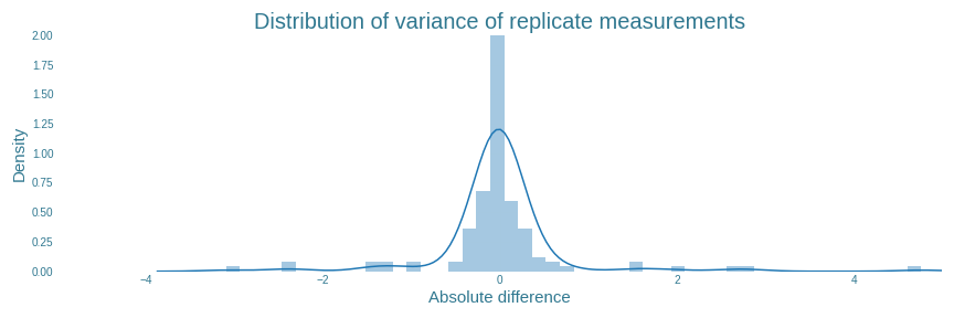
Now that the ART is able to interpret the results, it is also able to filter out some of the samples in which the replicates of those samples show unexpected measurements. A closer look at Figures 9, 10 and 11 from the “Preprocessing of the data” section shows that some samples show substantial variation between their replicates. The plot shown in Figure 22 shows the distribution of how far each replicate deviated from the mean value of the same sample. If this variance is substantially more than the average variance, there is a good chance that something went wrong when measuring at least one of the replicates. Which one exactly, is impossible to tell for sure. Therefore, it is recommended to exclude all samples in which the variance within replicates exceeds some threshold.
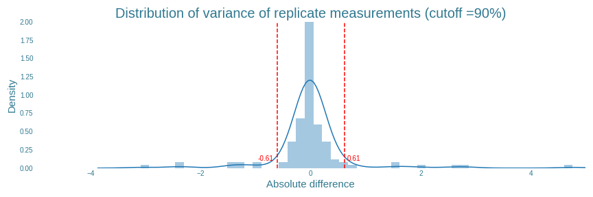
The ART has a built-in function for this. The ART tool excludes all replicates which have an absolute variance greater than some percentage of all the data. For our data, setting this percentage to $90\%$ results in all outlying results to be filtered out, as shown in Figure 23. It also shows that the actual cutoff value is determined to be $0.61$. In total, 16 individual replicates from 6 samples were found with absolute variance higher than $0.61$. The exact values of these replicates can be found in ‘final_sample_list.csv’ on our github page.
After all this work it is finally time to execute the regular ART pipeline, wait for it to be trained and analyse the results!
Results
The first thing shown by the ART is how well the cross-validated models (as discussed in the “‘Overcoming’ the difficulties of ML” section) are able to fit the training data. This data is shown in table 1. The two most important measures for representing this fit is the Mean Squared Error (MSE) between the prediction and the actual measurement and the $R^2$-value, representing how much of the variance within the data is explained by the model. If this $R^2$ is $<0$, the model is not able to explain any of the differences between the data points. If this value is $1$, the model is able to explain all of the variance within the data points. Therefore, a good model is characterised with an $R^2$-value close to $1$. The MSE should generally just be as close to 0 as possible.
MSE and $R^2$ values of all models within the ensemble model used by the ART
| Model name | Model MSE | $R^2$ |
|---|---|---|
| Neural Regressor | 5.170913 | -0.482436 |
| Random Forest Regressor | 1.651443 | 0.526552 |
| TPOT Regressor | 1.31616 | 0.622674 |
| Support Vector Regressor | 1.947223 | 0.441756 |
| Kernel Ridge Regressor | 36.500463 | -9.464223 |
| K-NN Regressor | 3.730261 | -0.069419 |
| Gaussian Process Regressor | 1.806399 | 0.482128 |
| Gradient Boosting Regressor | 1.954661 | 0.439623 |
| Ensemble Model | 1.282173 | 0.632417 |
Table 1 also shows the 8 different models used by the ART. Again, delving into the details of these models is beyond the scope of this wiki. The important part is that each of these models is a regressorRegressors are stastical processes used for estimating the relationship between a responce variable (often called the 'outcome' or 'dependant' variable) and one or more explanatory variables (often called 'predictors', 'covariates', 'independant variables' or 'features')[7].. An intuitive interpretation of these regressors is seeing it as a method for the curve fitting described in the "Difficulties of Machine Learning" section. The final “Ensemble Model” is the Bayesian Ensemble Model described in the “‘Overcoming’ the difficulties of ML” section. The most important takeaways from table 1 are that some of the models are performing really poorly, with the “Kernel Ridge Regressor” having an $R^2$-value of $\sim-9.64$. However, the “Ensemble Model” still manages to have the lowest MSE and the highest $R^2$-value. This shows the added benefit of using an ensemble model instead of only a single model.
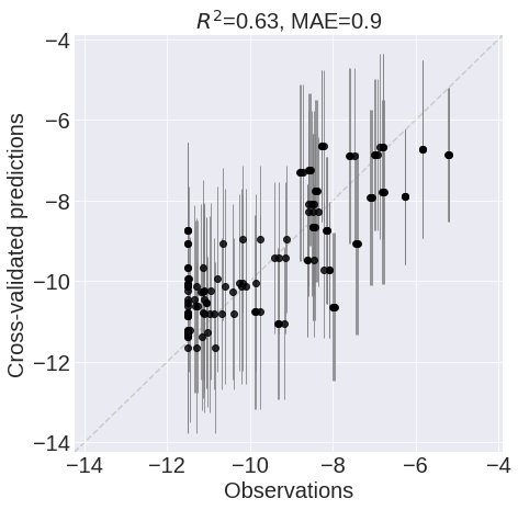
It is good practice to analyse the data from which these values originate a bit further. This is done using a correlation plot, shown in Figure 24. In this plot, the predictions of the model are plotted against the actual observations (i.e. the taken measurements). A perfect model would show a straight diagonal line (i.e. the predictions are equal to the observations). This is however rarely the case. The most important trend to look for is that there is some linear correlation. If the observation is high, so should the prediction be. Furthermore, the correlation plot also shows if the model has difficulties with making predictions on some of the samples. This would result in a datapoint in either the upper left or the lower right corner. If this occurs, it should be considered a red flag and additional analysis is needed to Figure out why the model is having difficulties making this prediction before it can be assumed that the model is generalizable to new data. A first suggestion would be to check whether the model is under- or overtrained. Another suggestion would be to look whether it would be possible that the observed data can be attributed to an erroneous measurement, although be wary of excluding these measurements as they might induce a biasA bias can occur when the designer of the model excludes all the data that does fit his own interpretation of what the data should look like. If this interpretation is incorrect, the generalizability of the model decreases. into the model.
Finally, it is possible to say something about how confident the model is in its predictions by looking at the Confidence Intervals (CIs) of the predictions of Figure 24. It is noticeable that almost all of the CIs have a spread of almost $\pm 2$ around the predicted mean value. Considering that all predictions range between $-6$ and $-12$, it is reasonable to assume that the exact measurement taken from a sample might deviate from the predictions made by the model. Therefore, it might be better to focus on the qualitative predictions made by the model instead of the quantitative.
Recommendations
We have finally reached the end goal of using the ART; making recommendations on which samples from the combinatorial library to test next. As shown in the diagram of the ART pipeline, the ART is able to make both exploitativeExploitative recommendations are recommendations that exploit the knowledge of the model. These recommendations are therefore the samples which are expected to yield the best results. and explorativeExplorative recommendations are recommendation that aim to improve the knowledge of the model. These recommendations are therefore the samples for which the prediction of the model is most uncertain. recommendations. We decided to only analyse the first 30 recommendations.
The exploitative recommendations are shown in table 2. Based on the current training data, it is clear to see that a combination of the αMF secretion signal and the alpha-amylase encoding gene originating from B. subtilis are expected to yield the best results. Furthermore, the pPGK1 promoter occurs 3 times in the top 5 results. Considering that the sample which used the ySB77 strain as its chassis has already been tested (as shown in the results page) and yielded the best results of the entire dataset, it is very likely that a sample containing the pPGK1 promoter, αMF secretion signal and the B.subtilis alpha-amylase genes will yield one of the highest alpha-amylase activities. However, bear in mind that there is a lot of uncertainty involved with these predictions. If more certainty is needed, it would be wise to first test some of the exporative recommendations. Furthermore, the predicted activity of all samples is lower than the measured activity of samples SP001 and SP038 ($0.0055$ and $0.0029$ (d[p-nitrophenol]/dt) respectively).
The exploitative recommendations. More information on the parts can be found on the engineering page
| Rank | strain | promoter | secretion | gene | Predicted ln(activity) | Predicted activity |
|---|---|---|---|---|---|---|
| 0 | ySB78 | pPGK1 | αMF | B.subtilis | -6.241298 | 0.001947 |
| 1 | ySB78 | pTDH3 | αMF | B.subtilis | -6.323765 | 0.001793 |
| 2 | ySB76 | pRNR2 | αMF | B.subtilis | -6.363736 | 0.001723 |
| 3 | ySB85 | pPGK1 | αMF | B.subtilis | -6.388392 | 0.001681 |
| 4 | ySB76 | pPGK1 | αMF | B.subtilis | -6.435489 | 0.001604 |
| 5 | ySB77 | pRNR2 | αMF | B.subtilis | -6.521911 | 0.001471 |
| 6 | ySB77 | pTDH3 | αMF | B.subtilis | -6.566358 | 0.001407 |
| 7 | ySB76 | pHHF1 | αMF | B.subtilis | -6.573551 | 0.001397 |
| 8 | ySB76 | pRNR1 | αMF | B.subtilis | -6.666158 | 0.001273 |
| 9 | ySB76 | pTDH3 | αMF | B.subtilis | -6.676021 | 0.001261 |
| 10 | ySB85 | pRNR1 | αMF | B.subtilis | -6.689628 | 0.001244 |
| 11 | ySB77 | pRNR1 | αMF | B.subtilis | -6.707219 | 0.001222 |
| 12 | ySB76 | pPAB1 | αMF | B.subtilis | -6.75746 | 0.001162 |
| 13 | ySB77 | pREV1 | αMF | B.subtilis | -6.892306 | 0.001016 |
| 14 | ySB78 | pRNR1 | αMF | B.subtilis | -6.892674 | 0.001015 |
| 15 | ySB85 | pPAB1 | αMF | B.subtilis | -6.914319 | 0.000993 |
| 16 | ySB76 | pTEF1 | αMF | B.subtilis | -6.930234 | 0.000978 |
| 17 | ySB78 | pPAB1 | αMF | B.subtilis | -6.938977 | 0.000969 |
| 18 | ySB76 | pREV1 | αMF | B.subtilis | -6.942261 | 0.000966 |
| 19 | ySB85 | pTEF1 | αMF | B.subtilis | -6.95399 | 0.000955 |
| 20 | ySB77 | pPAB1 | αMF | B.subtilis | -6.968985 | 0.000941 |
| 21 | ySB78 | pRPL18B | αMF | B.subtilis | -6.980546 | 0.00093 |
| 22 | ySB85 | pTDH3 | αMF | B.subtilis | -6.996441 | 0.000915 |
| 23 | ySB77 | pTEF1 | αMF | B.subtilis | -7.012753 | 0.0009 |
| 24 | ySB78 | pREV1 | αMF | B.subtilis | -7.057184 | 0.000861 |
| 25 | ySB78 | pRAD27 | αMF | B.subtilis | -7.06477 | 0.000855 |
| 26 | ySB85 | pRNR2 | αMF | B.subtilis | -7.082414 | 0.00084 |
| 27 | ySB78 | pRNR1 | αMF_no_EAEA | B.subtilis | -7.096215 | 0.000828 |
| 28 | ySB78 | pTEF1 | αMF | B.subtilis | -7.134024 | 0.000798 |
| 29 | ySB76 | pRAD27 | αMF | B.subtilis | -7.223168 | 0.000729 |
The explorative recommendations are shown in table 3. While these patterns might seem mostly random at first sight, there are some striking patterns that reflect the frequency and variance distributions shown in Figures 7 and 8. For instance the pTDH3 promoter which was shown to be underrepresented in the training data, is part of 8 out the 30 exploratory recommendations. If all promoters were equally distributed across the recommendations, it should have occurred around 3 times. Also the αMF_no_EAEA secretion signal occurs more often ($13/30$) than expected($\sim7.5/30$). However, the ySB76 occurs a lot less ($1/30$) than expected ($\sim7.5/30$) even though Figure 8 shows it contributes less to the overall variance in the dataset than the other strains.
The explorative recommendations. More information on the parts can be found on the engineering page
| Rank | strain | promoter | secretion | gene | Predicted ln(activity) | Predicted activity |
|---|---|---|---|---|---|---|
| 0 | ySB78 | pTDH3 | αMF | B.amyloliquefaciens | -10.158696 | 0.000039 |
| 1 | ySB78 | pTDH3 | Native | B.amyloliquefaciens | -10.167739 | 0.000038 |
| 2 | ySB78 | pRPL18B | αMF_no_EAEA | A.oryzae | -9.694006 | 0.000062 |
| 3 | ySB78 | pPAB1 | αMF_no_EAEA | B.licheniformis | -9.807968 | 0.000055 |
| 4 | ySB78 | pTDH3 | αMF | B.subtilis | -6.323765 | 0.001793 |
| 5 | ySB78 | pPGK1 | αMF | B.amyloliquefaciens | -10.157919 | 0.000039 |
| 6 | ySB78 | pTDH3 | Native | B.subtilis | -7.246373 | 0.000713 |
| 7 | ySB78 | pRNR1 | αMF_no_EAEA | B.amyloliquefaciens | -10.167606 | 0.000038 |
| 8 | ySB78 | pRNR1 | αMF_no_EAEA | A.oryzae | -9.742028 | 0.000059 |
| 9 | ySB78 | pHHF1 | αMF_no_EAEA | B.amyloliquefaciens | -10.261079 | 0.000035 |
| 10 | ySB78 | pREV1 | αMFΔ | A.oryzae | -9.40958 | 0.000082 |
| 11 | ySB78 | pPGK1 | αMF | A.oryzae | -9.517837 | 0.000074 |
| 12 | ySB77 | pPGK1 | αMF | A.oryzae | -9.564904 | 0.00007 |
| 13 | ySB77 | pPGK1 | αMF | B.licheniformis | -9.353338 | 0.000087 |
| 14 | ySB78 | pRAD27 | αMF_no_EAEA | A.oryzae | -9.827786 | 0.000054 |
| 15 | ySB78 | pRNR1 | αMF_no_EAEA | B.licheniformis | -9.966545 | 0.000047 |
| 16 | ySB76 | pTDH3 | αMFΔ | B.licheniformis | -9.201508 | 0.000101 |
| 17 | ySB78 | pREV1 | αMF_no_EAEA | A.oryzae | -9.898024 | 0.00005 |
| 18 | ySB78 | pHHF1 | αMF_no_EAEA | B.subtilis | -7.240897 | 0.000717 |
| 19 | ySB77 | pREV1 | αMF | A.oryzae | -9.653788 | 0.000064 |
| 20 | ySB77 | pTDH3 | αMF | B.subtilis | -6.566358 | 0.001407 |
| 21 | ySB85 | pRAD27 | αMF_no_EAEA | A.oryzae | -9.909267 | 0.00005 |
| 22 | ySB77 | pTDH3 | Native | B.subtilis | -7.454713 | 0.000579 |
| 23 | ySB85 | pRAD27 | αMF | A.oryzae | -9.6954 | 0.000062 |
| 24 | ySB78 | pRNR2 | αMF | A.oryzae | -9.705825 | 0.000061 |
| 25 | ySB78 | pHHF1 | αMF_no_EAEA | B.licheniformis | -10.126075 | 0.00004 |
| 26 | ySB77 | pHHF1 | αMF | A.oryzae | -9.733338 | 0.000059 |
| 27 | ySB78 | pPGK1 | αMF_no_EAEA | B.licheniformis | -10.143406 | 0.000039 |
| 28 | ySB78 | pTDH3 | αMF_no_EAEA | B.amyloliquefaciens | -10.471749 | 0.000028 |
| 29 | ySB78 | pPGK1 | αMF | B.licheniformis | -9.498398 | 0.000075 |
Conclusions
Overall, we can conclude that the model produced by the ART will most likely be able to generalize to new measurements reasonably well. The $R^2$-value of $0.63$ is similar to the $R^2$-value of $0.57$ reported in similar research where a $74$ and $43\%$ improvement in tryptophan titer and productivity, respectively, was found compared to the best sample in their training library[2]). Unfortunately, uncertainties regarding the prediction of the ART on tryptophan titer and productivity were not communicated in this research. Therefore, it is difficult to compare the two.
Given that the uncertainties within the prediction of our model can be considered to be on the high side, it is likely that testing the exploitative recommendations will lead to an improvement over the currently best performing sample. However, these recommendations need to be tested in order to say for certain whether the ART served its purpose. Unfortunately, we had neither the time nor resources to do so.
The usefulness of using PCA to check whether each variant of a part contributes somewhat equally compared to the other part-variants can also be debated. Most of the observations made in the results section could have been found by looking at the frequency distribution of the part-variants. It is however nice to have additional ways of confirming if the plan that was set out before starting the experiments will achieve its goal. By looking at the variance distribution, we were able to confirm that our initial subset was likely to yield a varied set of results.
Improvements
- We measured the OD of all samples after the incubation period in order to account for different amounts of cells being sampled for the start of the incubation period. After taking the measurements, we realized that the linear relationship between cell count at the start of the incubation period and the cell count at the end of the incubation period does not exist. Instead, all samples plateau in cell count due to the nutrients in the media being depleted at the end of the incubation period. Because of this, we were no longer able to account for differences in cell counts between samples. Therefore, there might be a bias in our data where samples with higher cell counts at the beginning of the incubation period showed a higher alpha-amylase activity. We recommend making sure the OD of all samples are equal to each other before starting the overnight culture for future experiments. While it does not ensure equal cell counts for all samples, it is a better proxy than the OD of the sample after incubation.
Note: We made this realisation after having started writing the content for our wiki and github repository. We tried correcting everything, but there might still be some artifacts mentioning “correcting the activity by the OD of the sample”. If interested, you can view the original pipeline before we decide to omit the correction for the OD in the `previous_versions` folder on our github.
- After running additional experiments with lysating the cells by bead beating before measuring the alpha-amylase activity, we realized that one of the major bottlenecks in the activity of alpha-amylase activity is the secretion of the enzyme. The results differed to such a degree, that we reckon that bead beating could be a way to solve the problem of having only a few samples showing higher degrees of alpha-amylase activity.
- After conducting most of our experiments, we found out that half of our genes encoding for alpha-amylase contained mutations that could potentially affect the functioning of the enzyme (see the results page). Both the genes originating from B. amyloliquefaciens and B. licheniformis showed these mutations. This could have biased our results. Therefore, the experiments should be repeated with genes that do not have any mutations in them.
- We realized the PCA does not solve the problem raised in section creating a well-balanced subset of the combinatorial library after closer inspection of the functionality of PCA. Nonetheless, using PCA to check whether each variable adds sufficiently to the variability in the dataset can still be seen as a valuable addition to checking the frequency distribution of the variables within the dataset. However, the question on how to solve the issue raised in afore mentioned section remains unsolved.
- We have not been able to properly check whether the model was either under- or over fitted. This is generally done by looking at the learning curve of the cross-validated model. While Zhang, Petersen & Radivojević et al.[2] do provide code on how they did it for their model, we were unable to get this code working in time. It would be highly recommended to get this code working to gain additional insight in the working of the model.
Predicting protein structures
Besides randomly sampling the combinatorial library and hoping to find good results, it might also be nice to have some prior knowledge beforehand. If you for instance expect a certain protein variant to yield better results than the other variants, it could be useful to increase the amount of samples with that particular protein. Under these circumstances it might be nice to use Molecular Dynamics in order to for instance predict the receptor-ligand binding energy. Or one could look at whether a secretion peptide somehow interacts with the protein to which it is attached. In order to be able to do this, the structure of the different protein variants are needed. While uniprot has an extensive database of proteins and their structures, these structures will not be available if your team made changes to the protein. Luckily, the researchers of DeepMind recently released their new version of AlphaFold to the public, which has been shown to have remarkable accuracy on predicting the protein structure of the protein in the CASP14 dataset[8].
AlphaFold 2 is able to regularly predict protein structures with atomic accuracy, even in cases where no homologue is available[8]. Even though the technology behind it is truly amazing, explaining the concepts behind the algorithm would take way too long (and are admittedly beyond our knowledge). But don’t be afraid, there are again plenty of materials online that explain the theory behind it in detail. If you are an expert on ML and Molecular Dynamics, you might be able to decipher the original publication[8]. If not, a blog post by the Oxford Protein Informatics Group[9] captures the principles behind AlphaFold really nicely. The workhorse behind the algorithm is a technique called Bidirectional Encoder Representations from Transformers (or BERT for short[10]). This tutorial by Samia Khalid might be a great way of getting a better understanding of AlphaFold in case the blog post of the Oxford Protein Informatics Group was still a bit too complex.
Now, how does AlphaFold apply to our project? We learned a few weeks after the public release of AlphaFold that it had been installed on the hypercluster of our university, Peregrine. We were really excited as AlphaFold is expected to have major implications for the molecular dynamics community. The structure produced by AlphaFold can help with predicting the biochemical function of the protein or virtual ligand screening to predict which small molecules/drugs it might bind and how. Furthermore, it can also help in ligand homology modelling ligand docking, even though this could also be performed on protein structures with a lower accuracy than those produced by alphaFold [11]. Mainly the last proposed implementation was interesting to our team as we were aiming to improve the binding site of the alpha-amylase variant recommended the most by the ART.
Unfortunately, our expertise with Molecular dynamics was not sufficient to be able to locate which part of the binding site could be changed in order to improve ligand docking. We were however able to help out our colleagues of the DTU-biobricks team! They wanted to gain insights into how the addition of a secretion signal and yfp-tag influenced the structure of various parts of the Membrane-Associated Methane Monooxygenase (pMMO) protein complex. Have a look at their modeling page to see the results!
This does mean that the question on how to optimize the binding site of the most recommended enzyme, the alpha-amylase originating from B. Subtillis, remains unanswered.
Genome-scale modelling
As part of our collaboration with the iGEM team from DTU-Denmark, they offered us their help to set up a genome-scale model of our device. The DTU-Biobuilders team had already been using genome-scale modelling to understand their own device and therefore, they were familiarized with the technique. The genome-scale model of S. cerevisiae with alpha amylase genes they provided for us, allowed us to perform a growth analysis on our machine.
What is genome-scale modelling?
Gene-protein-reaction associations from an entire organism can be computationally described and used to predict simulated metabolic fluxes, this is known as Genome-scale models [12]. This is based on the stoichiometry of the reactions that happen in a cell, taking into consideration the location of the reactions. To learn more go to DTU-biobuilders 2021 page!
Bye-monia model
Our device consists of the chassis Saccharomyces spp. in which different alpha amylase genes were independently expressed. S. cerevisiae (the main host employed in our project) is a model species, meaning that there is a lot of research done on it. Therefore, a lot of effort has been put in developing accurate models of the organism. The most up-to-date mathematical model iMM904[13] is used in this analysis. The model accounts for 1226 metabolites, 1577 reactions and 905 genes in total. With the help of the cobraPy package for Python[14] it is possible to insert or delete reactions to the model, DTU-Biobuilders added the different genes to the model iMM904 for a more accurate version of our model.
Purpose of the model
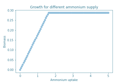
As we were planning to feed our GMO with ammonium as the only source of nitrogen, we aimed to understand how the different concentrations of ammonium will affect the growth of the organisms. Finding a range of ammonium concentrations in the media in which the growth of the device won’t be altered motivated us to dig into this model.
Results
The growth under different ammonia concentrations in the different models doesn’t vary, the graph generated is constant.
Flux of ammonia for each model optimizing the function growth.
| Model | Flux of ammonia |
|---|---|
| iMM904 | 1.611 |
| iMM904 + alpha amylase from A. oryzae | 1.615 |
| iMM904 + alpha amylase from B. amyloliquefaciens | 1.615 |
| iMM904 + alpha amylase from B. licheniformis | 1.615 |
| iMM904 + alpha amylase from B. subtilis | 1.615 |
Adding different alpha amylases genes doesn’t have any major consequences in the growth of the organism in different concentrations of ammonia. The different genes don’t add any major constraints in the cell metabolism. Additionally, we also observe that lower concentrations of ammonia may influence the growth of the yeast, increasing in a linear manner, until reaching a plateau in which adding more concentration of ammonium won’t result in better growth.
Conclusions
There are no major bottlenecks in the production of alpha amylase that would affect the growth of S.cerevisiae. Potentially the model could be used to perform deletion analysis, to study if biomass could be optimized by increasing the influx of ammonia in comparison to other components of the media, unfortunately we ran out of time for such an analysis.
References
- Radivojević, T., Costello, Z., Workman, K. et al. A machine learning Automated Recommendation Tool for synthetic biology. Nat Commun 11, 4879 (2020). https://doi.org/10.1038/s41467-020-18008-
- Zhang, J., Petersen, S.D., Radivojevic, T. et al. Combining mechanistic and machine learning models for predictive engineering and optimization of tryptophan metabolism. Nat Commun 11, 4880 (2020). https://doi.org/10.1038/s41467-020-17910-1
- Brown, T. B., Mann, B., Ryder, N., Subbiah, M., Kaplan, J., Dhariwal, P., ... & Amodei, D. (2020). Language models are few-shot learners. arXiv preprint arXiv:2005.14165.
- Ringnér, M. What is principal component analysis?. Nat Biotechnol26, 303–304 (2008). https://doi.org/10.1038/nbt0308-303
- Duignan, Brian. "Occam's Razor". Encyclopedia Britannica. https://www.britannica.com/topic/Occams-razor (accessed October 2021)
- Tin Kam Ho, "Random decision forests," Proceedings of 3rd International Conference on Document Analysis and Recognition, 1995, pp. 278-282 vol.1, https://doi.org/10.1109/ICDAR.1995.598994
- Alexopoulos E. C. (2010). Introduction to multivariate regression analysis. Hippokratia, 14 (Suppl 1), 23–28.
- Jumper, J., Evans, R., Pritzel, A. et al. Highly accurate protein structure prediction with AlphaFold. Nature 596, 583–589 (2021). https://doi.org/10.1038/s41586-021-03819-2
- AF2 is here: what’s behind the structure prediction miracle. Oxford Protein Informatics Group. https://www.blopig.com/blog/2021/07/alphafold-2-is-here-whats-behind-the-structure-prediction-miracle/ (accessed October 2021).
- Devlin, J., Chang, M. W., Lee, K., & Toutanova, K. (2018). Bert: Pre-training of deep bidirectional transformers for language understanding. arXiv preprint arXiv:1810.04805.
- Skolnick, J., Gao, M., Zhou, H., & Singh, S. (2021). AlphaFold 2: Why It Works and Its Implications for Understanding the Relationships of Protein Sequence, Structure, and Function. Journal of Chemical Information and Modeling.
- Gu, C., Kim, G.B., Kim, W.J. et al. Current status and applications of genome-scale metabolic models. Genome Biol 20, 121 (2019).
- Mo, M.L., Palsson, B.Ø. & Herrgård, M.J. Connecting extracellular metabolomic measurements to intracellular flux states in yeast. BMC Syst Biol3, 37 (2009). https://doi.org/10.1186/1752-0509-3-37
- Ebrahim, A., Lerman, J.A., Palsson, B.O. et al. COBRApy: COnstraints-Based Reconstruction and Analysis for Python. BMC Syst Biol7, 74 (2013). https://doi.org/10.1186/1752-0509-7-74